EVOLUTION OF POSTER ART, PART II: JESSE EWING
In the spirit of exploring process, let’s dig a little deeper into exactly how I put together the new poster for Our Country’s Good. This post will be a bit technical, but that’s what this blog is for.
In the past, I’ve explored ideas by sketching in a notebook. I still do this, but I’m making an effort to try to move the sketching phase into Procreate on my iPad. The app, combined with the Apple Pencil, is pretty darned close to using a real pencil on paper. One benefit to this switch is being able to save out my sketches as Photoshop documents. Once in Photoshop I can use the sketches as reference layers or I can continue to refine them in order to generate final images.
For this poster I needed reference for the shape of the Australian continent and four portraits to create the quartered face graphic. The shape of Australia was easy enough to find. I traced a map in Adobe Illustrator using only straight lines to match the style of “paper cutout” graphics we’ve been using in the Seat of the Pants branding. Illustrator differs from Photoshop in that artwork is created in vector format, which is scaleable to any size without a loss in resolution. Photoshop uses raster graphics, which are made up of fixed pixels, so scaling an image to a larger size creates a blurry graphic. The final poster would be composed in Illustrator as well.
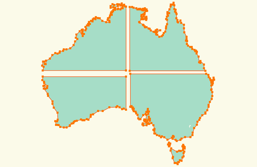
Once traced, the shapes were tilted slightly and filled with colors from the Seat of the Pants brand palette.

I also thought it would be interesting to see the original portrait reference before being altered and incorporated into the poster design. One difficulty I ran into was finding portraits facing forward, looking straight at the viewer. Nearly all portraiture from the eighteenth and nineteenth century is presented in a three-quarter view with the subjects looking off to the side.

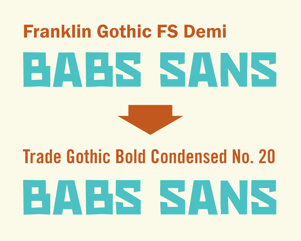
One final element was typography. For the “lost” 2020-21 season, an update to the fonts used on the posters was made from a version of Franklin Gothic to Trade Gothic Condensed. The decision was based on the need for setting longer names and blocks of text, as well as looking better alongside the main brand font, Babs Sans (created just for Seat of the Pants and named after Craig’s dog). Franklin Gothic is still used for body text and copy in other materials and on the website.
And as a reminder, the final poster:
