EVOLUTION OF POSTER ART: PART I
The pandemic has postponed or cancelled many plans, wreaking havoc on regular schedules and making it nearly impossible to figure out your calendar in advance with any sort of guarantee that six months from now you’ll still be able to do the thing you were hoping to do. People joke about time having no meaning anymore. But meanwhile there seems to be a growing recognition of how precious our time actually is, and a movement to take back some of it for ourselves. Along with this has been a trend towards digging deep into what is most important in our lives, and an urge to simplify.
It was unfortunate though not surprising that the 2020-21 season of Seat of the Pants was called off due to COVID-19 restrictions. But it opened up an opportunity to rethink the idea of what a theater season can look like, and how, through that lens of simplification and deeper examination, the work for that lost season can inform the artwork for this new 2022 season.

Here is the original poster artwork for Our Country’s Good. The design of the title, author, and Seat of the Pants bug was consistent throughout all of this season’s posters. The main artwork followed the Saul Bass “cutout” style that was established earlier on. It’s not a bad concept but there’s a lot going on. It’s busy. Compare this to the following three posters created for the 2020-21 season.


For these, we mixed up elements of the cutout style with black and white graphics in an antique, engraved style for an interesting contrast. The title and author treatment was a bit more formal. It felt like a nice evolution of the Seat of the Pants brand. The design was still lively but the concepts were bolder and more simplified. We decided to rework the poster for Our Country’s Good to fit with this new direction.
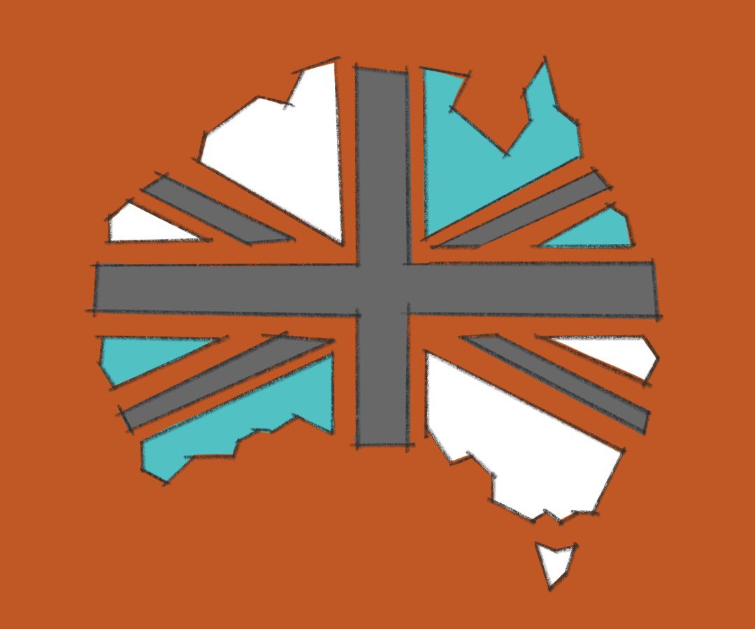
I had been thinking of a different way to present the themes of class, gender, and race so inherent to the play. I had the idea of four different faces quartered and rearranged to make one face starting straight at you. I also wanted to use the shape of Australia. For my first sketch, I played with incorporating the lines of the Union Jack to divide up the continent, but it was unnecessary and left too little room for the faces.

I made a quick mockup of the poster layout with a draft of the artwork in place. We agreed it was close but needed some finesse. I searched for better representations of the types of characters in the play and changed the order of the faces. I flip-flopped the colored sections of Australia. And finally, we “dirtied up” two of the faces to look more like prisoners. We had our poster.
